TablePage form
The TablePage component includes a built-in form for viewing, inserting, and updating records in the database table. To enable the form, provide the form prop to the TablePage component.
Fields
The fields parameter allows you to specify the form fields displayed in the insert and update forms.
By default, form fields are automatically generated based on your database schema and defineTableController settings. However, we recommend explicitly defining the fields parameter to exclude unnecessary fields and simplify future maintenance.
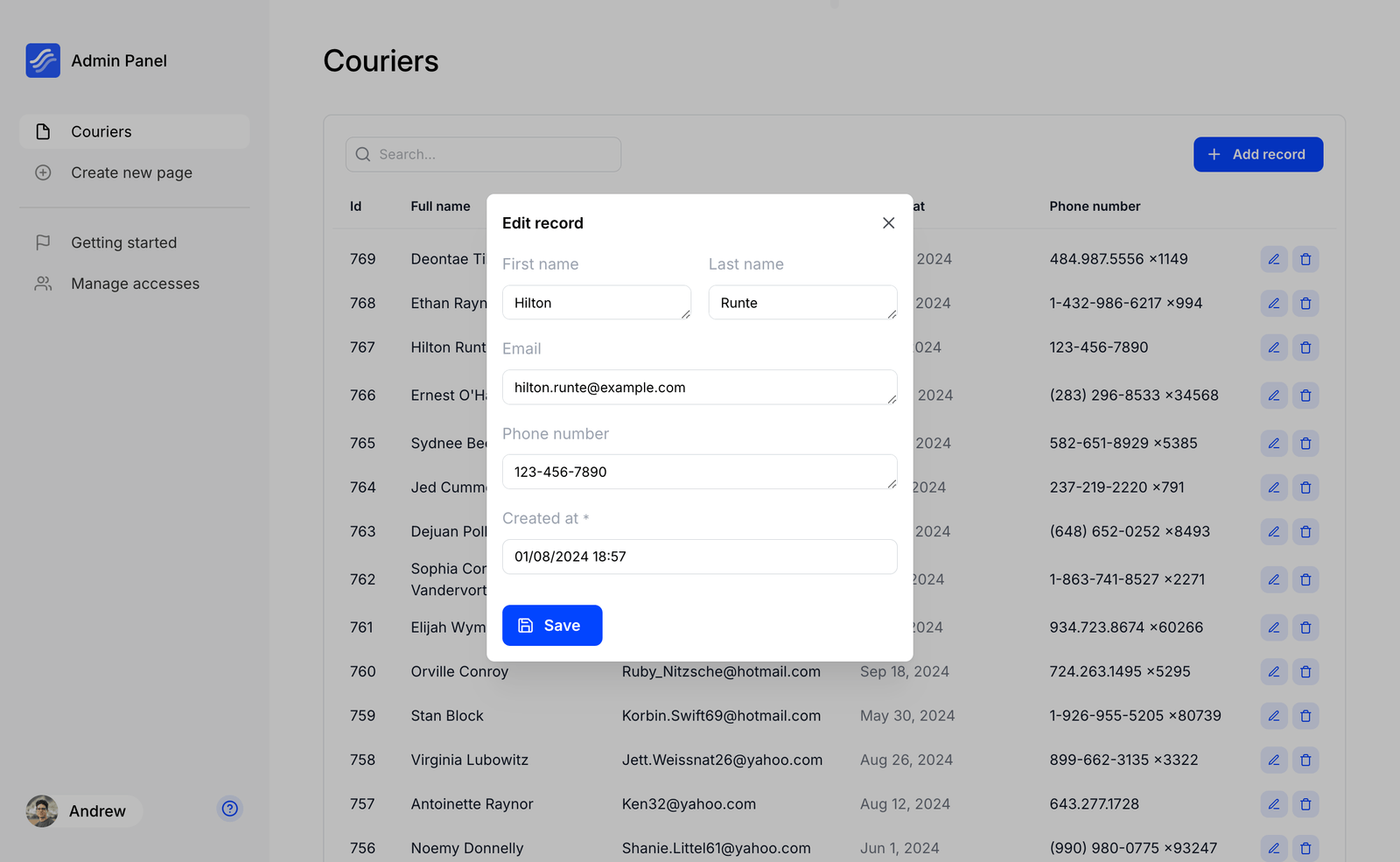
Here’s an example of the fields parameter with defined fields:
<PageTable
  columns={/* ... */}
  form={{
    fields: [
      { label: 'First name', column: 'first_name', type: 'input' },
      { label: 'Last name', column: 'last_name', type: 'input' },
      { label: 'Email', column: 'email', type: 'input' },
      { label: 'Birth date', column: 'birth_date', type: 'datePicker' },
    ]
  }}
/>
Each field is an object with the following options:
- column (
string): The name of the column in the table. - label (
string, optional): The label displayed to users for this field. Defaults to the column name if not provided. - formField (
string, optional): Specifies the type of form field to use for this column - required (
boolean, optional): If true, this field must be filled out in form. - span (
number, optional): Defines the layout span for this field in a 12-column grid system. Defaults to 12 if not specified.
Basic field types
The type property defines the field type and supports additional properties depending on the type.
Below is a list of supported formFields types and their interfaces:
-
input
A single-line text input.
{
  type: 'input'
} -
numberInput
A number-only input field.
{
  type: 'numberInput',

  /** Determines whether decimal values are allowed, true by default */
  allowDecimal?: boolean;
} -
textarea
A multi-line text input.
{
  type: 'textarea'
} -
select
A searchable dropdown menu.
{
  type: 'select',

  /** List of selectable options */
  options: {
    /** Display label for the option */
    label: string;

    /** Value associated with the option */
    value: string;
  }[]
} -
checkbox
A checkbox for boolean input.
{
  type: 'checkbox'
} -
datePicker
An inline date (datetime) picker.
{
  type: 'datePicker',

  /** Adds time picker */
  withTime: boolean,

  /** Adds seconds input to time picker */
  timeWithSeconds: boolean
} -
timePicker
An inline time picker.
{
  type: 'timePicker',

  /** Adds seconds input */
  withSeconds: boolean;
} -
recordSelect
Select records from another table.
Requires a one-to-one relationship to be configured (see one-to-one linked).
{
  type: 'recordSelect',

  /** Linked settings in defineTableController are automatically applied,
      no need to specify tables and columns here */
}
Custom field
Use a custom React component for input.
{
  type: 'custom',

  /** Function to render a custom React component */
  renderComponent: (
    value: any,
    onChange: (value: any) => void,
    params?: {
      hasError: boolean;
      readOnly: boolean;
    }
  ) => any
}
{
  type: 'custom',

  renderComponent: (value, onChange) => (
      <MyCustomInput value={value} onChange={onChange} />
  ),
}